Lung Cancer Among European Countries​

Histogram
Time-Series Plot
Scatter Plot
Bar Chart
Authors

Luciana Claure Parada

Mckenna Barton

Jack Bussen

Landon Jordan

Published

December 10, 2024

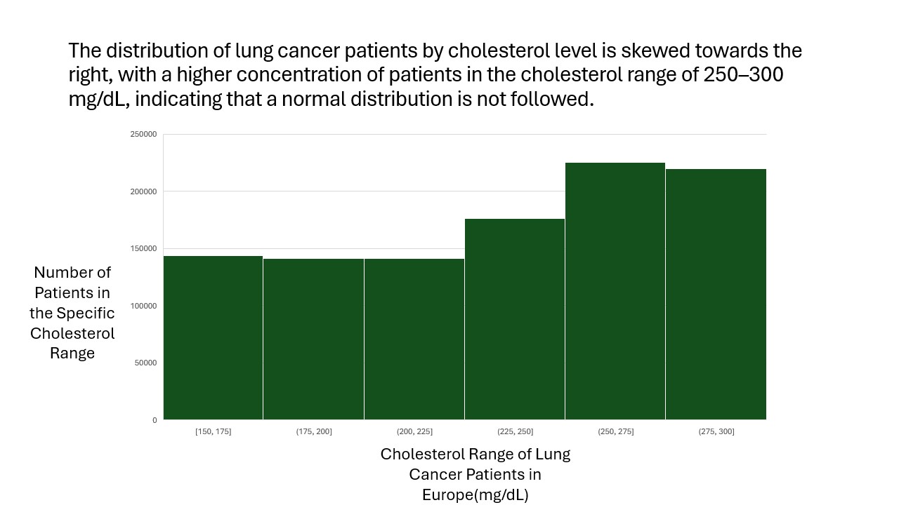
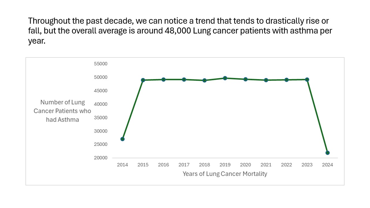
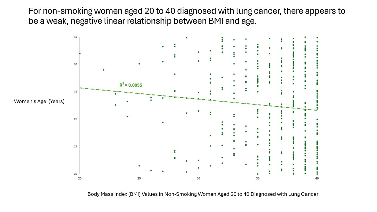
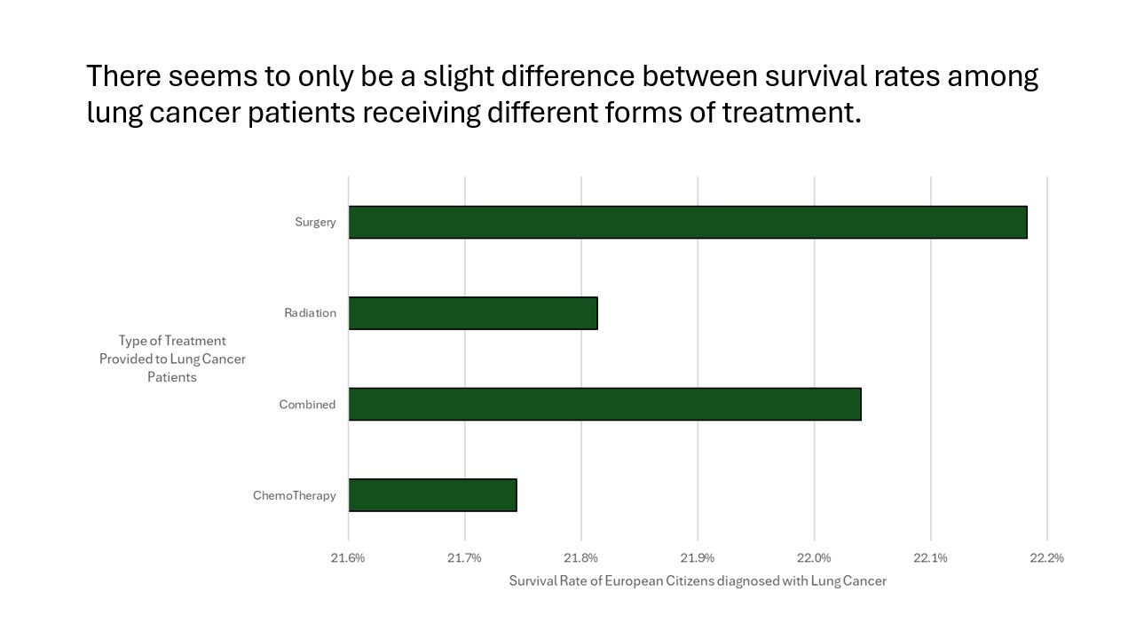
This semester, our team was tasked with selecting a data set that we found interesting and using that data set to answer questions we found intriguing. We were also tasked with creating a set of unique “data-visualization” slides to answer our questions. The data set that we selected covers lung cancer patients in European countries. Each row describes a single patient and various information regarding their diagnosis with lung cancer. The data set has information such as: The date of diagnosis, the start and end of their treatment, the type of treatment they received, if they were a smoker, if they were male or female, what country they were diagnosed in, the age they were diagnosed, a few specific columns regarding their level of health, and lastly if they survived or not.

Is there any trend for cholesterol levels among lung cancer patients in Europe? This question explores whether lung cancer patients in Europe show specific trends in their cholesterol levels. It focuses on identifying patterns, such as whether cholesterol levels are consistently high, low, or variable among these patients. The aim is to understand if cholesterol levels are linked to the condition or its progression in this population. This question is interesting to me because cholesterol level is typically linked to heart disease and heart problems, so I am curious if there is a pattern for lung cancer as well. My team and I used Microsoft Excel to answer this question after gathering the data from the internet. First, we made a new sheet within the workbook and pasted only the cholesterol level of the patients. Then we made a highlighted all the data and made a histogram. We had to manually make the bins for the cholesterol ranges, so we decided on a range of 25 because the cholesterol levels range from 150 to 300. This amounted to 6 total bins. Finally, we took this graph and pasted it into a power point slide to start the assertion evidence slide. To develop the visual for this slide, we gave the chart informative axis labels and wrote our assertion at the top of the slide.

Question: Is there a trend with the number of Lung Cancer Patients who had asthma throughout the decade? This was an interesting question to see because I was curious is there was a high number of patients who had a correlation with asthma and Lung Cancer. It based on the data, we could see that at the beginning and the end of the decade there are various extremities, but this could be the fact that there was not a lot of data that was reported. However, throughout the decade we can see that there is a relative average of 48000 patients who had asthma with Lung Cancer. The steps we took to complete this task, was filtering out the patients that did not have asthma, which left about 491000 patients to see the data throughout the years 2014-2024. From there we created our chart, and noticed that we could see a drastic increase of about 200000 from the years 2014 to 2015, and then a 200000 decrease from the years 2023 to 2024, now this could be from just there wasn’t a bunch of data those year, but throughout the remaining years we saw a average of about 48000 patients who had lung cancer and asthma. We thought this would be an interesting topic to just see how many patients have asthma, but also to notice throughout the years, whether to see if there was some type of pattern.

Question: Is there a correlation between BMI and age in non-smoking women aged 20 to 40 diagnosed with lung cancer? This question examines whether there is a relationship between body mass index (BMI) and age in this specific group. It aims to understand if BMI changes significantly with age and whether these changes might be relevant in the context of lung cancer. To answer this question, the data was first filtered to include only females diagnosed with lung cancer, aged 20 to 40, who are non-smokers. Then, I focused on the Age and BMI columns from the dataset. These columns were copied into a separate sheet to create a scatter plot with BMI as the x-axis and age as the y-axis. I also added a linear trendline to visualize any potential relationship between the two variables and included the R² value to quantify the strength of the correlation. Finally, the scatter plot was added to the PowerPoint presentation. The slide contains a clear assertion summarizing and visualizing the result for non-smoking women aged 20 to 40 diagnosed with lung cancer, which indicated a weak negative linear relationship between BMI and age.

Question: Do different treatment options effect the chances of survival for a lung cancer patient? Do different treatment options effect the chances of survival for a lung cancer patient? This question asks if the type of treatment a lung cancer patient receives affects their chances of survival. It seeks to explore whether certain treatments, like chemotherapy, radiation, or surgery, lead to better survival outcomes. The goal is to understand how treatment choices influence a patient’s prognosis. In order to answer this question, we began by turning towards the ‘Survival’ and ‘Treatment’ columns. Then we used those to create a pivot table. The pivot table allowed us to find our survival rates for each treatment option. Then, using those rates, we created a bar chart displaying each treatments survival percentage, being sure to use detailed axis titles. Lastly, it was time to plug our chart into the slideshow and add a proper assertion describing the answer to our question.